Natixis INVESTMENT MANAGERS
Natixis INVESTMENT MANAGERS
Natixis INVESTMENT MANAGERS
Natixis INVESTMENT MANAGERS
PROJECT Description
Natixis Investment Managers, part of the French Groupe BCPE finanical group, is one of France's largest asset management companies. Their website was severely outdated in terms of both the content, organisation and design.
I was tasked with leading the UI redesign of the website, creating a series of adaptable components with a distinct style across both the company website and the fund centre. This project was completed using a waterfall approach, with several batches of designs.
Client
Natixis Investment Managers
Year
2024
Type
UI Design, Design System
Client
Natixis Investment Managers
Year
2024
Type
UI Design, Design System
Client
Natixis Investment Managers
Year
2024
Type
UI Design, Design System
Client
Natixis Investment Managers
Year
2024
Type
UI Design, Design System
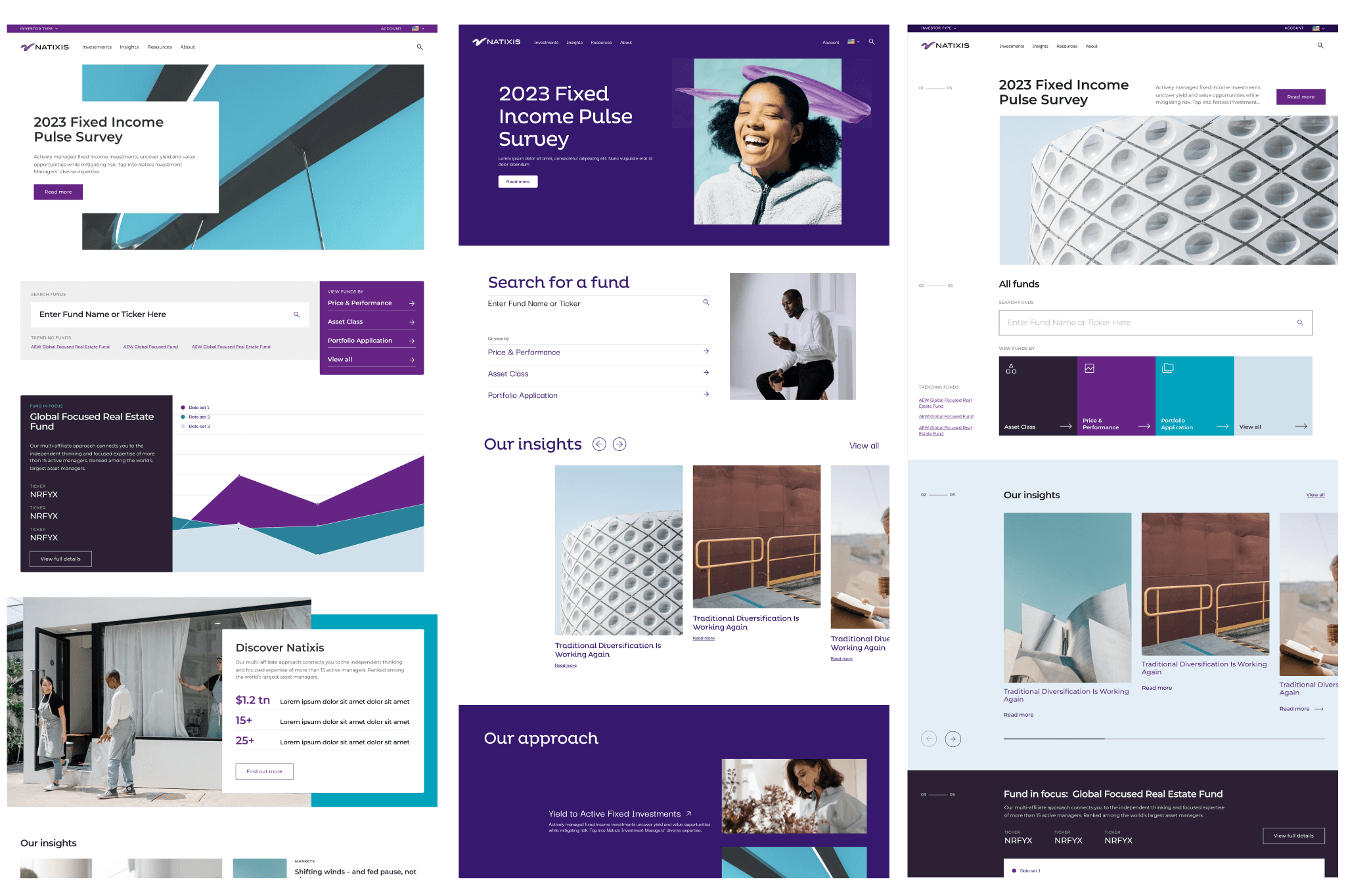
An initial look and feel exploration took place, helping me understand the clients requirements and design preferences. From this a series of atoms were established leading into the component design.
An initial look and feel exploration took place, helping me understand the clients requirements and design preferences. From this a series of atoms were established leading into the component design.
An initial look and feel exploration took place, helping me understand the clients requirements and design preferences. From this a series of atoms were established leading into the component design.
An initial look and feel exploration took place, helping me understand the clients requirements and design preferences. From this a series of atoms were established leading into the component design.

These components needed to have both light and dark versions, with several colourways. They also needed variations for mobile, tablet and desktop to cover all eventualities of responsive design.
After these components were completed, all variants alongside documentation were added into a deliverable file for developers.
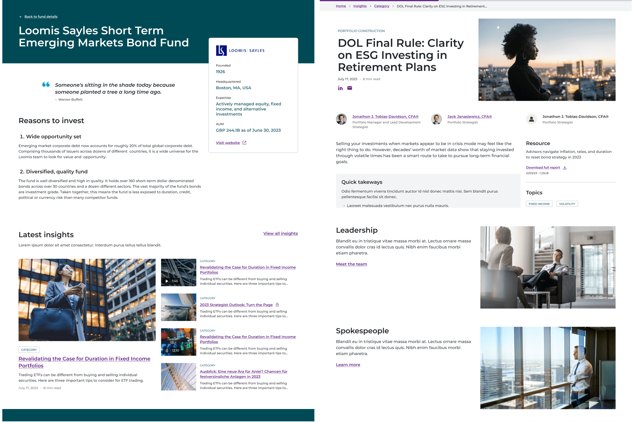
Working alongside the UX team and the developers, I created over thirty pages across five batches, advising on colour usage and component guidance.
Working alongside the UX team and the developers, I created over thirty pages across five batches, advising on colour usage and component guidance.
Working alongside the UX team and the developers, I created over thirty pages across five batches, advising on colour usage and component guidance.
Working alongside the UX team and the developers, I created over thirty pages across five batches, advising on colour usage and component guidance.


The look and feel I had created with this project required updating Natixis' image library to reflect the modern style. This created a project I also led afterwards, sourcing images and creating guidelines to help the new website designs flourish as old content was replaced.
The look and feel I had created with this project required updating Natixis' image library to reflect the modern style. This created a project I also led afterwards, sourcing images and creating guidelines to help the new website designs flourish as old content was replaced.
The look and feel I had created with this project required updating Natixis' image library to reflect the modern style. This created a project I also led afterwards, sourcing images and creating guidelines to help the new website designs flourish as old content was replaced.
The look and feel I had created with this project required updating Natixis' image library to reflect the modern style. This created a project I also led afterwards, sourcing images and creating guidelines to help the new website designs flourish as old content was replaced.