JLG
JLG
JLG
JLG
PROJECT Description
A leading designer and manufacturer of aerial support equipment wanted to redesign their website and improve visitor sales conversions.
The existing buying experience was bloated and lacked a clear pathway for unsure users to pick the correct product. I concepted and designed a calculator that would simplify the process and smoothly guide customers to the relevant information alongside the main redesign.
Client
JLG
Year
2024
Type
UI Design, Prototyping
Client
JLG
Year
2024
Type
UI Design, Prototyping
Client
JLG
Year
2024
Type
UI Design, Prototyping
Client
JLG
Year
2024
Type
UI Design, Prototyping
JLG already had a functioning calculator, however the experience was hidden away and consisted of three confusing dropdowns. I decided to bring it front and centre, highlighting it as a key component in the pages redesign. I also changed the language used to help simplify the experience for new customers.
JLG already had a functioning calculator, however the experience was hidden away and consisted of three confusing dropdowns. I decided to bring it front and centre, highlighting it as a key component in the pages redesign. I also changed the language used to help simplify the experience for new customers.
JLG already had a functioning calculator, however the experience was hidden away and consisted of three confusing dropdowns. I decided to bring it front and centre, highlighting it as a key component in the pages redesign. I also changed the language used to help simplify the experience for new customers.
JLG already had a functioning calculator, however the experience was hidden away and consisted of three confusing dropdowns. I decided to bring it front and centre, highlighting it as a key component in the pages redesign. I also changed the language used to help simplify the experience for new customers.
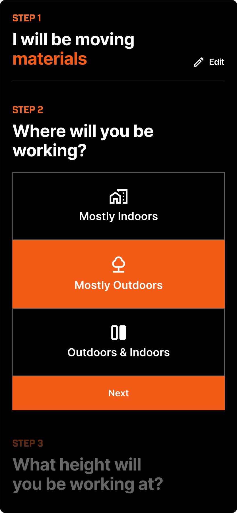

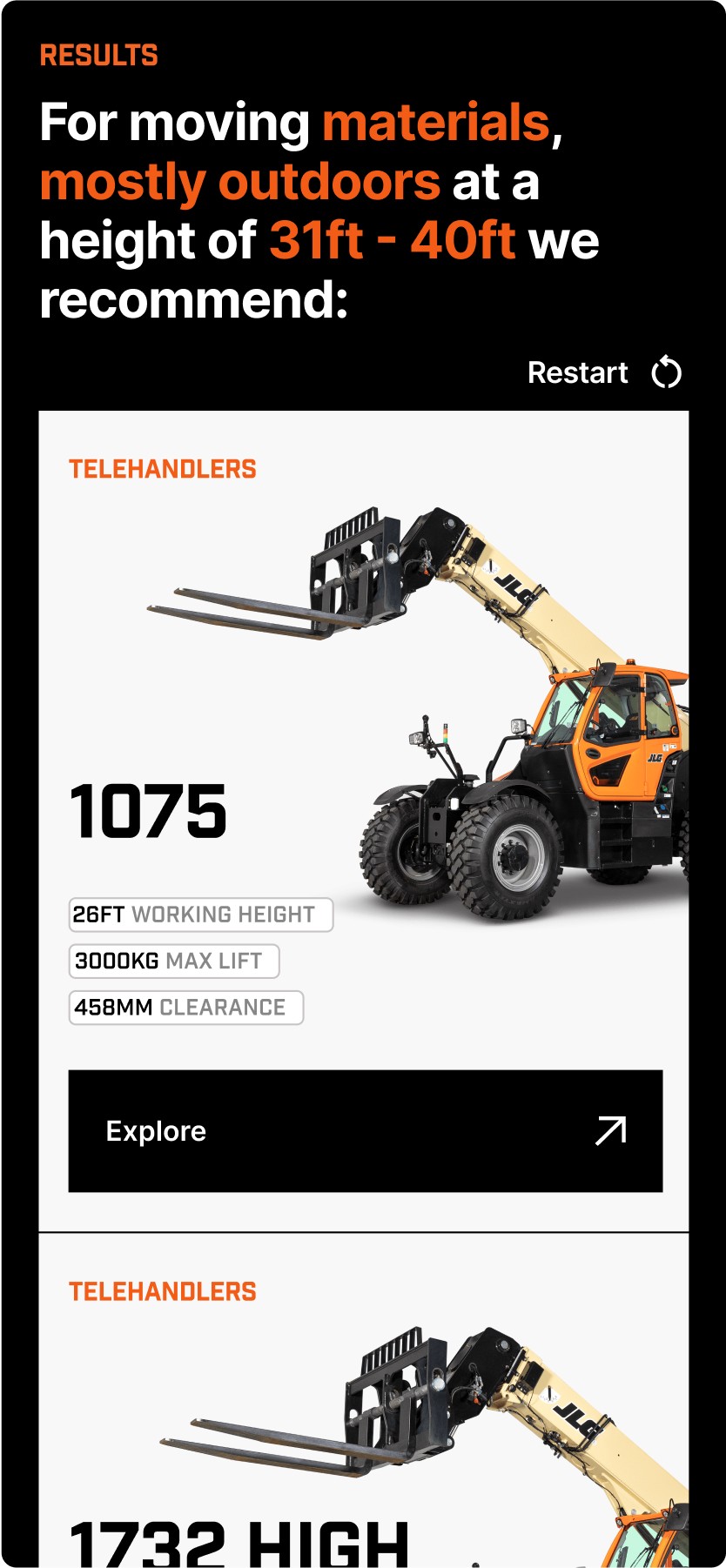

It was key that this experience functioned on both desktop and mobile, to which I carefully ensured there would be a seamless interchange between the two devices. The prototype was created entirely within Figma, with two breakpoints for previews.
It was key that this experience functioned on both desktop and mobile, to which I carefully ensured there would be a seamless interchange between the two devices. The prototype was created entirely within Figma, with two breakpoints for previews.
It was key that this experience functioned on both desktop and mobile, to which I carefully ensured there would be a seamless interchange between the two devices. The prototype was created entirely within Figma, with two breakpoints for previews.
It was key that this experience functioned on both desktop and mobile, to which I carefully ensured there would be a seamless interchange between the two devices. The prototype was created entirely within Figma, with two breakpoints for previews.
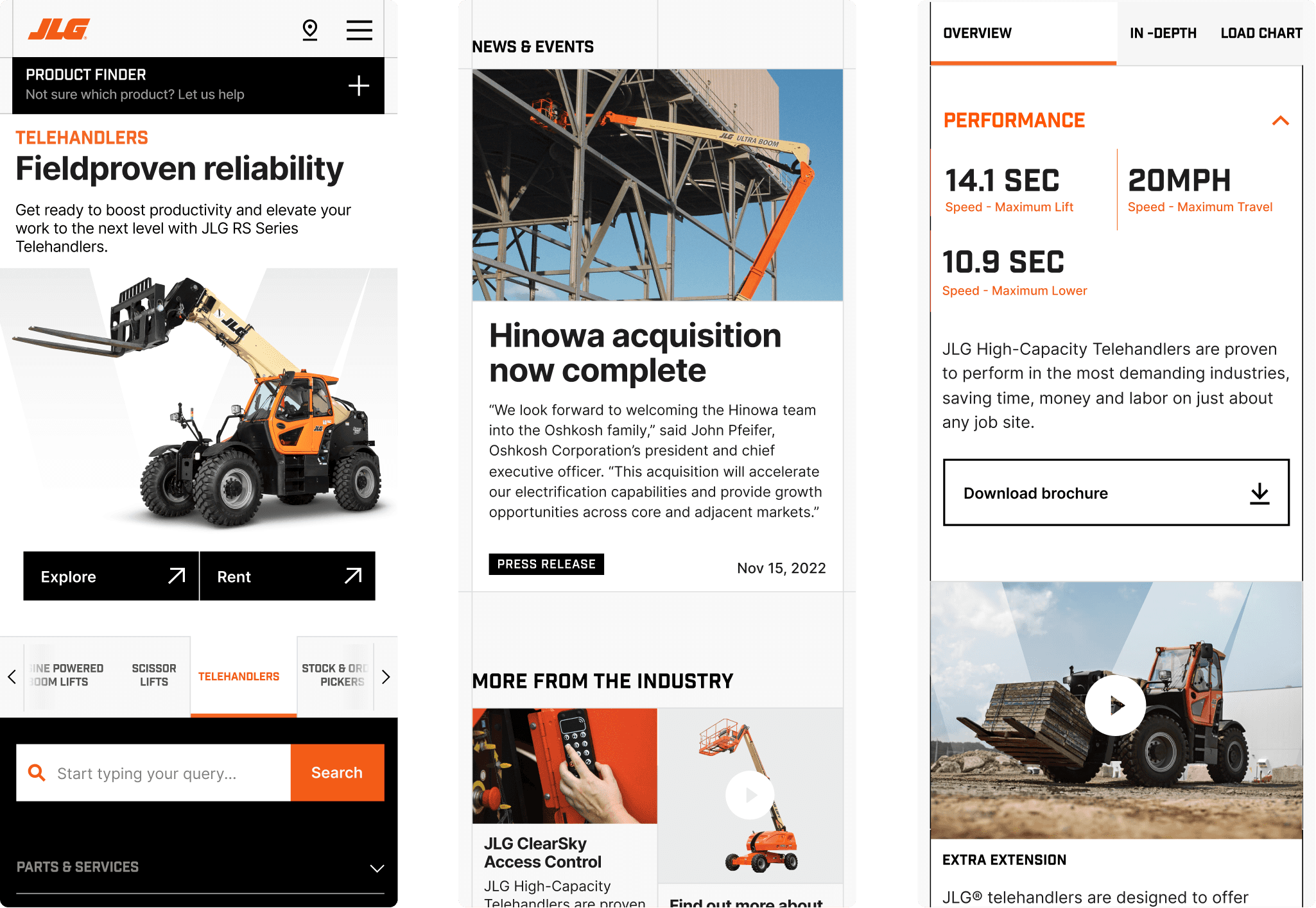
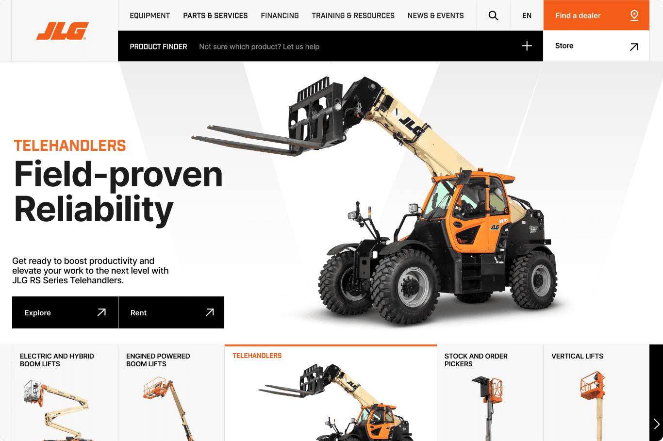
Although my focus for this project was on the calculator, I also helped create two full pages to show the larger scale redesign efforts and our vision for the website. I seamlessly integrated my prototype within these to allow for a full customer experience for the client.
Although my focus for this project was on the calculator, I also helped create two full pages to show the larger scale redesign efforts and our vision for the website. I seamlessly integrated my prototype within these to allow for a full customer experience for the client.
Although my focus for this project was on the calculator, I also helped create two full pages to show the larger scale redesign efforts and our vision for the website. I seamlessly integrated my prototype within these to allow for a full customer experience for the client.
Although my focus for this project was on the calculator, I also helped create two full pages to show the larger scale redesign efforts and our vision for the website. I seamlessly integrated my prototype within these to allow for a full customer experience for the client.
