DOordash for business
DOordash for business
DOordash for business
DOordash for business
PROJECT Description
DoorDash, a US based food delivery service wanted to improve their business based offering via a redesign of the website.
The brief was to "freshen up" the look and feel whilst largely retaining the same structure of components, allowing developers to update large sections via small changes.
Client
DoorDash
Year
2024
Type
UI Design
Client
DoorDash
Year
2024
Type
UI Design
Client
DoorDash
Year
2024
Type
UI Design
Client
DoorDash
Year
2024
Type
UI Design
Working alongside UX designers, a full audit of the existing website, pages and components was completed. From these audits, a list of flaws and issues with current components we wanted to address was created.
I completed early UI look and feel exploration that after discussion with the client, fed into rounds of wireframe design.
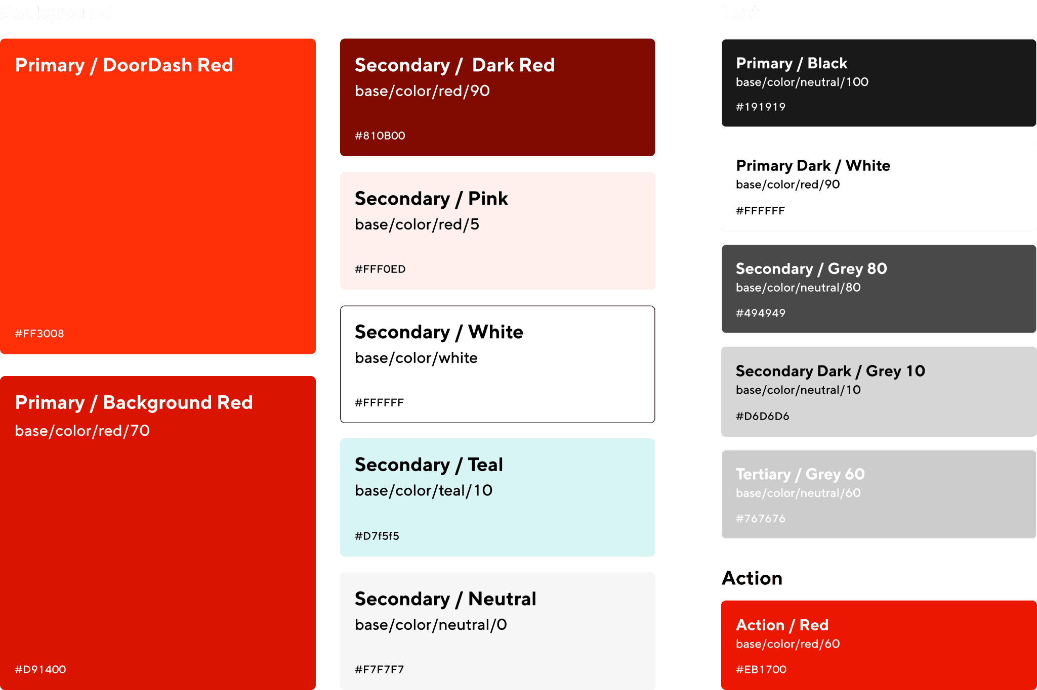
One of the key requirements for this project was that the redesign would use their mobile app design system, to encourage a consistent look and feel across their branding.
I established the atoms of the design; colours, typography, grids etc. We ensured that each of these elements fed into the app design system, so that developers could work with ease using their exising system.
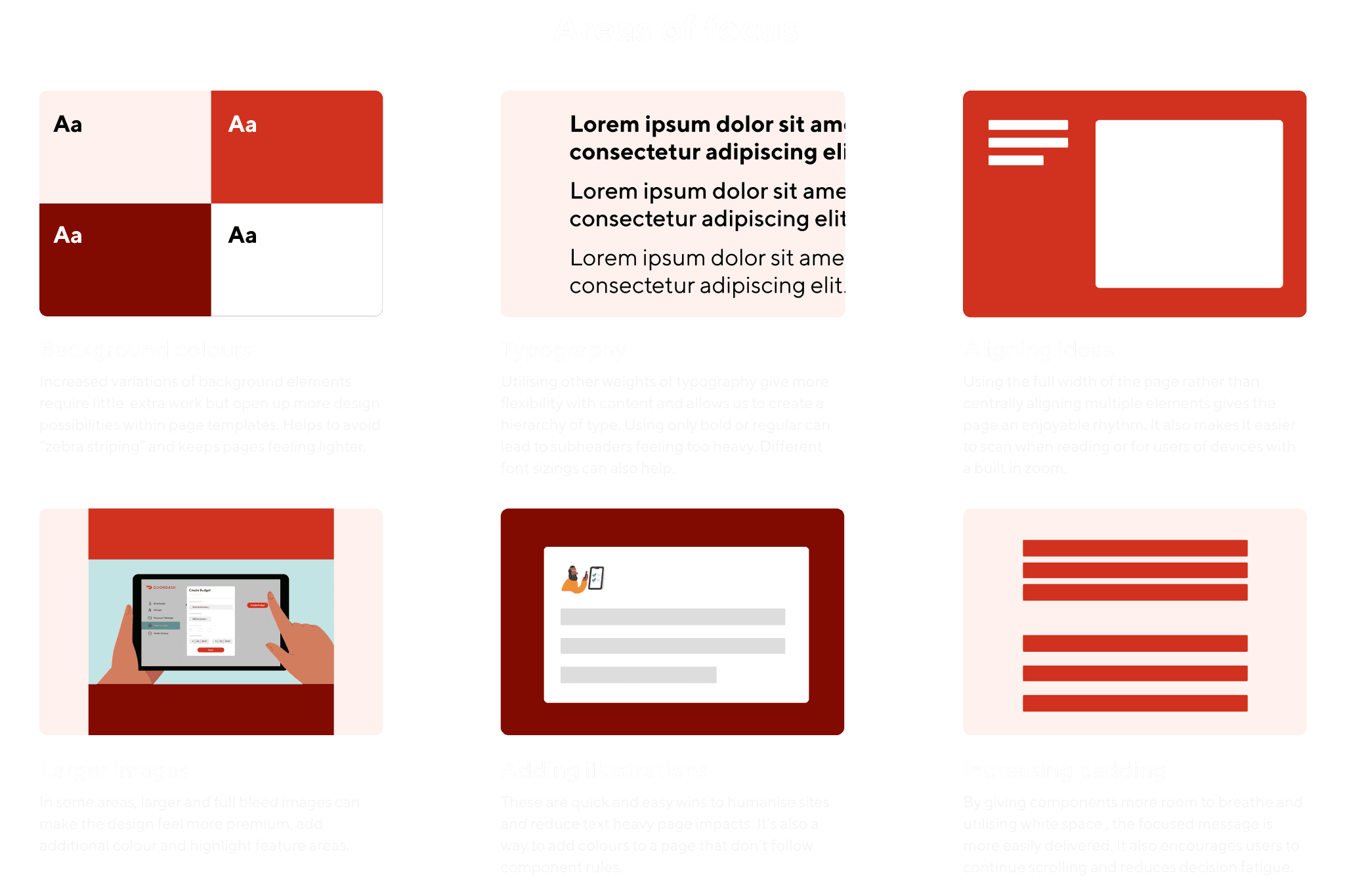
After finalising the atoms of the design with the client, I established a list of areas we were looking to address, and fitting the brief, how they can add up to modernise the website whilst retaining largely the same component list.
After finalising the atoms of the design with the client, I established a list of areas we were looking to address, and fitting the brief, how they can add up to modernise the website whilst retaining largely the same component list.
After finalising the atoms of the design with the client, I established a list of areas we were looking to address, and fitting the brief, how they can add up to modernise the website whilst retaining largely the same component list.
After finalising the atoms of the design with the client, I established a list of areas we were looking to address, and fitting the brief, how they can add up to modernise the website whilst retaining largely the same component list.
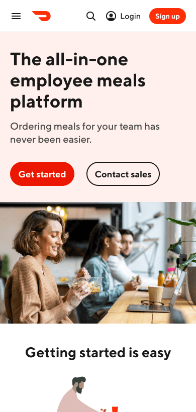
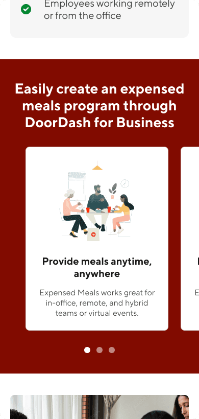
After establishing rules regarding the desired look and feel, I applied the above rules into their components, tweaking each to fit the desired purpose. I also sourced images to help change the tone of the website to a more desirable look.
Each component built in Figma had variations for both desktop and mobile designs.
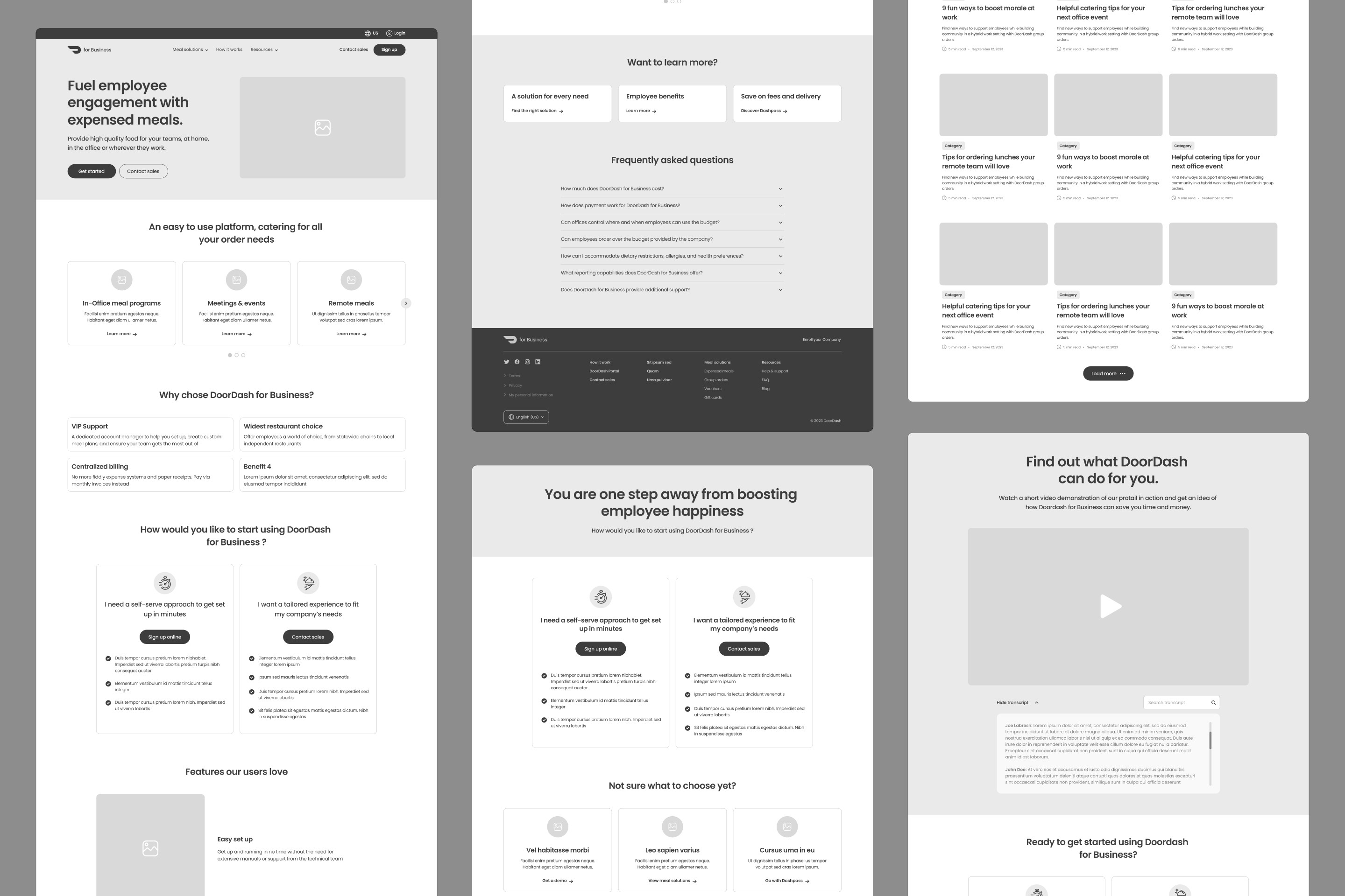
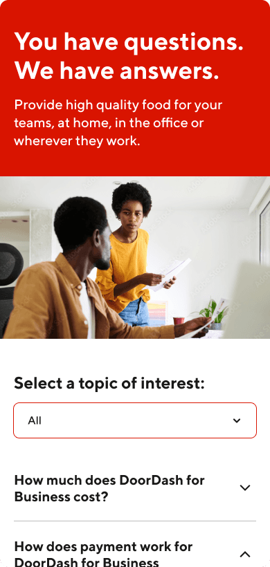
Using the components and the wireframes, I was able to build out any desired layout for the page templates.
Using the components and the wireframes, I was able to build out any desired layout for the page templates.
Using the components and the wireframes, I was able to build out any desired layout for the page templates.
Using the components and the wireframes, I was able to build out any desired layout for the page templates.
The client was incredibly happy with the results, how smoothly the process with their own development team had been and the flexibility of the designs to allow for further work with future branding elements.
The client was incredibly happy with the results, how smoothly the process with their own development team had been and the flexibility of the designs to allow for further work with future branding elements.
The client was incredibly happy with the results, how smoothly the process with their own development team had been and the flexibility of the designs to allow for further work with future branding elements.
The client was incredibly happy with the results, how smoothly the process with their own development team had been and the flexibility of the designs to allow for further work with future branding elements.